Billing & Business Online
SME Premium Insights
A Guide to Consumption Reporting
Consumption reporting provides a suite of reports which enable users to control energy usage and manage cost by accessing detailed analysis for each Business site.
Compare Costs Report provides a breakdown for what is directly impacting billing over a selected period, either monthly or annually.
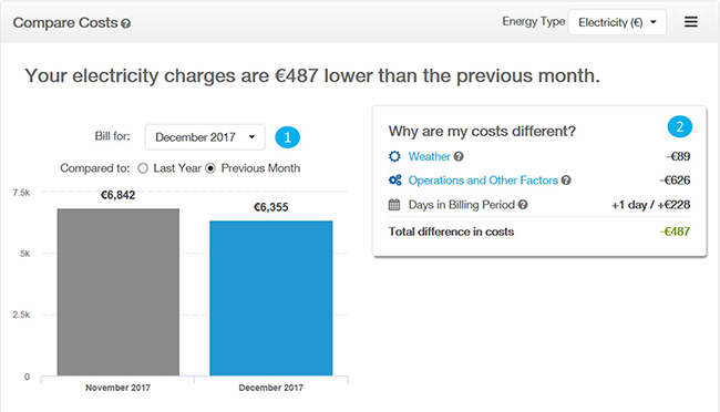
The Cost Comparison chart takes into account weather, operational changes and the number of days in a billing period. It is available for Gas and Electricity data. You can use this chart to compare to the same month last year or the previous month. The "operations and other factors" category may reflect your Business’ potential to act. For example, if a business has increased operating hours it may be looking to offset the increased energy usage.
Period selection You can select either a monthly view or annual view enabling users to identify what’s causing billing variances over a short term or medium term view.
Breakdown This section provides a view of how costs may vary over time and allows you to directly access the analysis behind this overview. There may be an impact by either weather or other operating factors such as sales, bookings or production.
The Cost and Consumption Chart displays electric and gas cost, consumption and demand as separate charts over a period of your account’s usage and cost history. This chart gives an overview of the usage trends. It is especially helpful to see the impact on cost and usage from changes in operations or equipment. Use it to monitor usage and cost and help you understand how your usage and cost vary throughout the year.
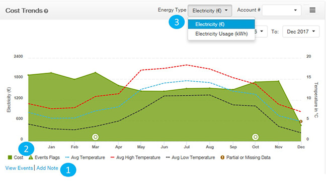
Notes: You can track, add and modify the implementation of any retrofits or projects implemented in your building.
Events: Events such as daylight saving, efficiency initiatives and actions, are displayed on this graph after you add notes.
Energy Type: You can select different review to review cost or energy usage over a selected period.
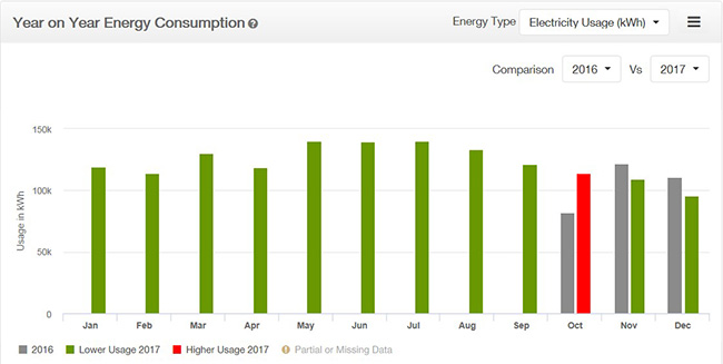
The Year on Year Comparison chart shows the current year's and previous year's electricity or gas cost. The previous year is displayed in grey. For any given month, when the current year's cost is less than the previous year's, the current year's bar is coloured green. If the cost is higher than the previous year the bar is coloured red. You can use this chart to quickly identify months where monthly costs are higher.
The monthly Weather Impact chart represents the business site’s total energy usage for the last year. The usage in kWh is shown on the left y-axis. Weather related usage is represented by blue bars and non-weather related (base) usage by grey bars. The weather related (blue) usage shows mostly heating and cooling consumption. The base usage (grey) represents lighting, plug load, miscellaneous and any heating or cooling that runs year round (aka baseload HVAC). The average high and low temperatures for each month are shown on the X-axis.
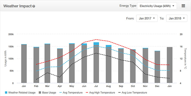
Note: You can remove the base usage by selecting “base usage” under the X-axis, this will give a view of usage directly attributed to weather trends.
The Operating Schedule Chart (available for customers with interval data meters)allows you to easily identify usage that is outside of the building’s normal business operating hours. The chart analyses interval energy usage across the past year and aggregates all of the usage across the day of the week and the time of day that it was used. A colour scale on the right shows the highest usage and the lowest usage recorded for the building.
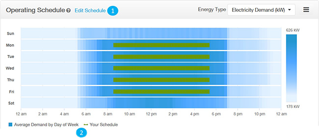
Typically, usage follows the building’s operating schedule. For example, if a building is open from 9:00am to 6:00pm, there should be fairly low usage outside of these hours. Significant usage outside that operating schedule period may indicate potential operational inefficiencies. If you added an operating schedule via the "Business Profile" tab, then “Your Schedule” will be superimposed in green on top of the chart.
1. You can update your schedule using the edit schedule facility
2. You can view usage only by deselecting the average demand by day of week section.
The Peer Comparison chart compares the energy intensity of the business site with similar businesses and building types in the Republic of Ireland and Northern Ireland.
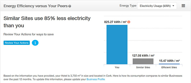
After reviewing the peer comparison data, then you can access the Savings tips that are calculated and recommended for a specific building by selecting review actions.
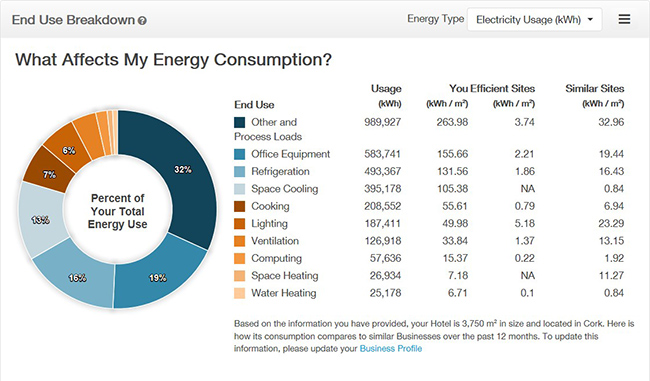
The End Use chart displays site and load-specific end-use estimates based on a unique model of each Business site. It demonstrates how the business site is consuming energy by various end uses (heating, cooling, computing, etc.), and how that breakdown compares to other buildings of a similar nature. Knowing how your site is using energy supports savings by showing where sites should prioritise on implementing energy savings measures.
To access SME Premium Insights please log in to Business Online.
Was this content helpful?
Did this answer your question?
Thank you for your feedback
Related content
Billing & Business Online
SME Premium Insights